Responsive Web Design
Hurray, we have a new buzzword: Responsive.
It's not brand new, but nowadays it's important because we use applications on different devices and the same application should work on different screen sizes/resolutions.
What does responsive mean?
Wikipedia:
Responsive web design (RWD) is a web design approach aimed at crafting sites to provide an optimal viewing experience—easy reading and navigation with a minimum of resizing, panning, and scrolling—across a wide range of devices (from mobile phones to desktop computer monitors).
My opinion:
Don't waste space for unnecessary information.
If you have big menus and toolbars in your application, you should reduce the used space dependent of the available space.
We did some experiments with our vaadin UI and have some impressions for you:
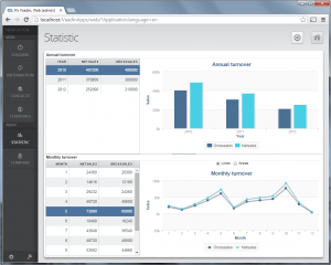
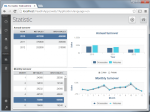
The application on the right has a small menu without additional text and with small padding. All gaps are smaller than in the orginal application on the left.
We used custom css and source code to change the UI because not everything was possible with CSS e.g. set tooltips instead of button text. A set of instructions was posted from Matti Tahvonen.
We made some smaller changes in our Vaadin UI to support technology independent handling of resize changes.
It will be possible to do following:
...
public void doLauncherResized(UIComponentEvent pEvent)
{
IDimension dim = ((ILauncher)pEvent.getSource()).getSize();
if (dim != null)
{
int iWidth = dim.getWidth();
if (iWidth < 800)
{
layoutMode = LayoutMode.Small;
}
else
{
layoutMode = LayoutMode.Full;
}
resizeMenu();
}
}


 RSS-Feed