On August 12, Flutter 3.47 was officially released, bringing a wave of exciting changes and brand-new features.
We always strive to keep our Flutter client as up to date as possible, so we took the plunge and upgraded early. Even though not all add-ons have been updated by the community yet, our client is running quite well. We did have to patch a few AddOns ourselves, but the community will certainly release updates in the coming weeks.
Here are the add-ons we have updated and patched so far:
Our VisionX App v3.4.0 has officially landed in the app stores. Over the past few weeks and months, we have poured a ton of energy into feature development, and it has truly paid off. With the new release, building sleek, custom applications is easier than ever. We put together a quick video to show you what we mean.
In the video, you will see a password management app built with 3 core screens: Secrets, Security Protocol, and Feedback.
The entire application was built and deployed with VisionX in just 20 minutes.
The first 30 seconds of the video show the menu and Secrets screen in their raw, out-of-the-box state. The app is fully functional right away, but there is plenty of room for visual polish - and that is where the magic happens starting at second 31.
First, we drop the header background color and hide the menu grouping, since small apps do not really need category groups anyway. Next, we update the global application color, which instantly propagates across all screens including Secrets.
Since the Secrets screen has its own header background, we clear that as well. By default, it features a search field, a button, and a data table. To save screen real estate, we convert the label into a sleek placeholder text with a magnifying glass icon, then align the search button directly beside the field. While tables are useful, a card-style list fits sparse data much better, so we swap the table for a list, color-code alternate rows for readability, and add dynamic icons.
The result is a clean, modern aesthetic that looks infinitely better.
Next up: the input form. Originally, it takes a traditional approach with standalone labels, input fields, and standard action buttons. Works fine, but with room for visual improvement. To modernize it, we integrate labels directly into the fields as placeholders, remove full button borders for a subtle look, and add a live password strength meter. We also tweak the required field color so it blends seamlessly with the new theme, and finish off with a clean border frame around the image.
The application now feels completely redesigned, fresh, and polished.
The absolute best part?
No rebuilding or new app deployment was required - just pure styling updates. The app dynamically adapts to whatever configuration you define.
For instance, switching from a table to a customized list is done in a single line:
We're happy to announce Flutter 3.44 support for our native app.
The core app and library flutter_jvx was successfully migrated to the new build system. We currently have some warnings about missing Swift Package Manager support for the packages:
webview_cookie_manager_plus
push
open_filex
flutter_tts
and missing AGP support for:
device_info_plus
file_picker
file_saver
flutter_device_platform_id
flutter_timezone
flutter_tts
haptic_feedback
mobile_scanner
package_info_plus
push
screen_brightness_android
speech_to_text
wakelock_plus
But hopefully these will be solved by package developers in next few months.
This highlights the dependency on packages within the open-source community.
Without the great work of many individual developers, this kind of development wouldn't even be possible!
What are the benefits of switching to Flutter 3.44?
Perceptible performance gains
The app is even smoother and faster than before. It looks absolutely amazing!
Future ready
Support for latest device features.
Bugfixes
Many bugs are only fixed in the latest version and won't be patched in older versions, like Keyboard toggle if you switch between input fields.
With latest core app, we fixed some smaller problems like table formatting and we introduced a nice feature:
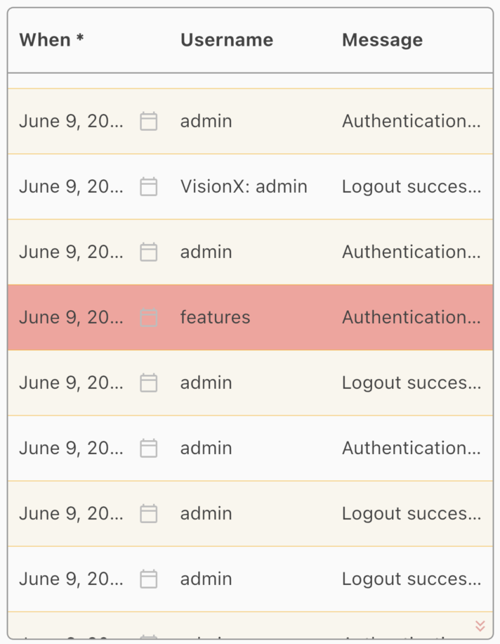
Records available
The table shows if more records are available with two arrows in the right bottom corner. It's a small improvement but vey helpful
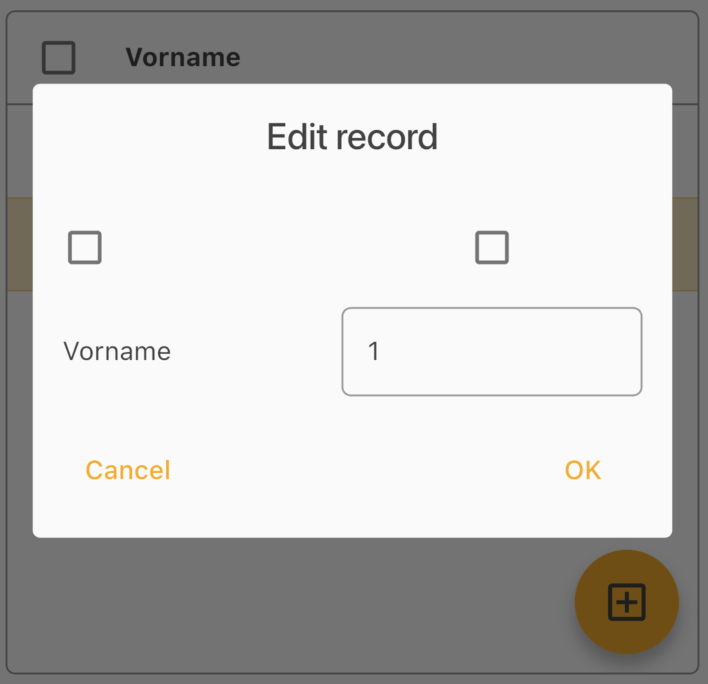
We also show a real checkbox in table edit dialog if you enable multi-line selection:
Real checkbox
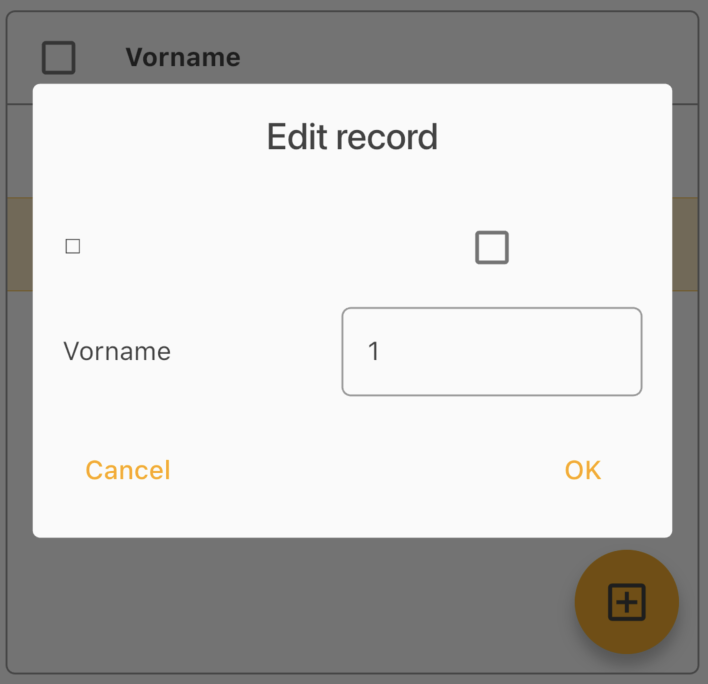
In older versions the checkbox was a UTF-8 font:
UTF-8 Checkbox
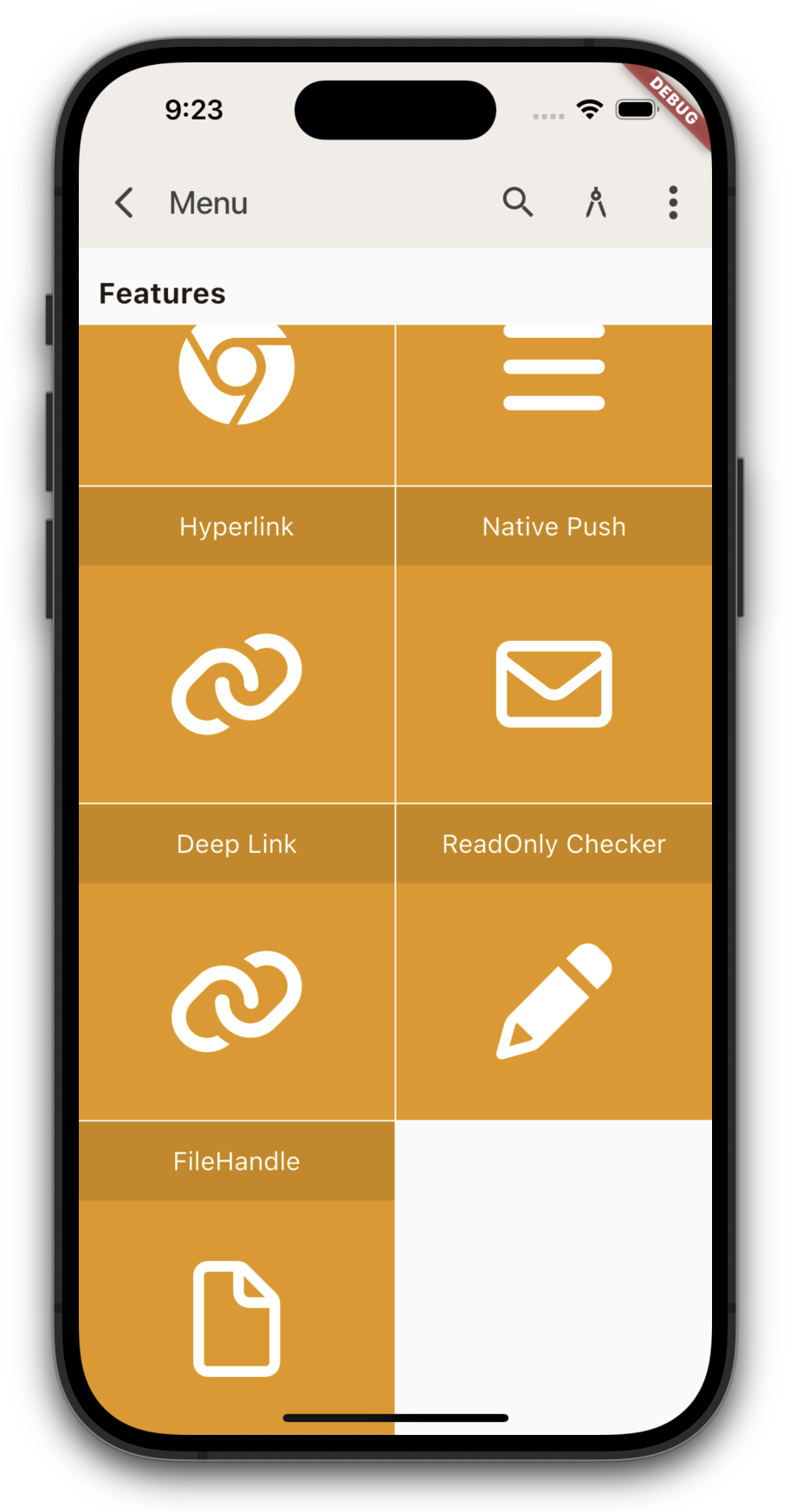
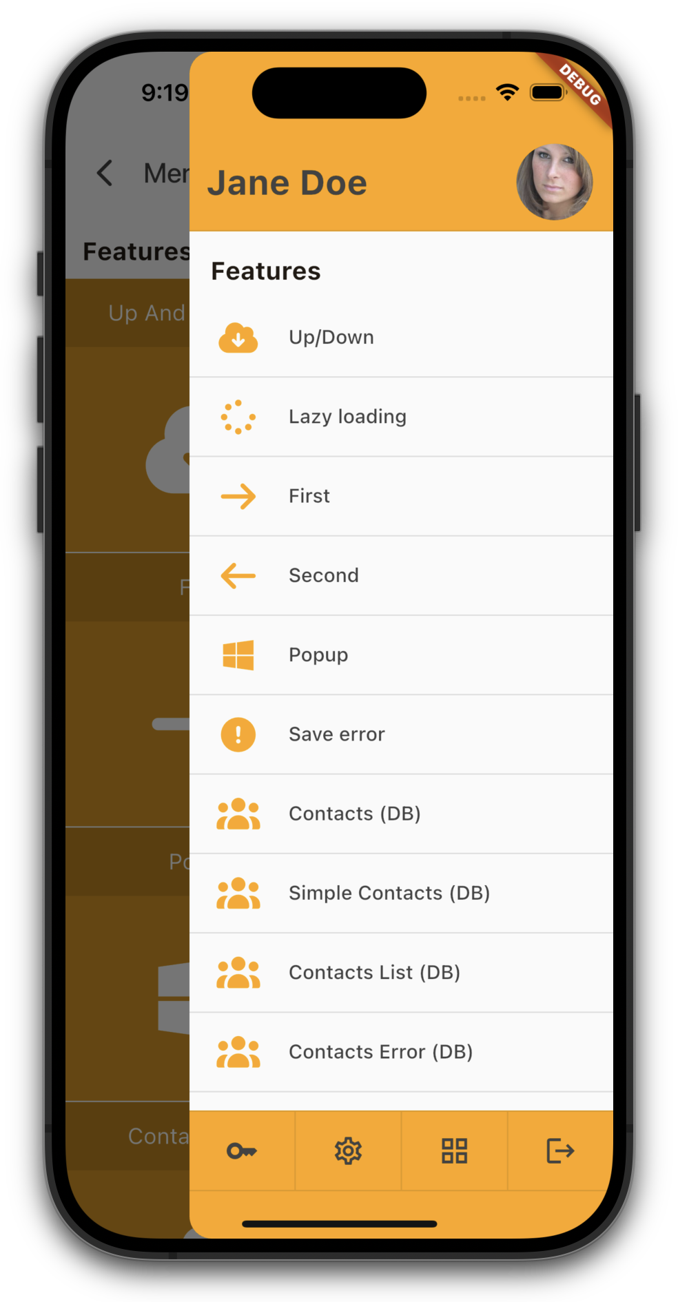
And last but not least, we pimped the menu a little bit.
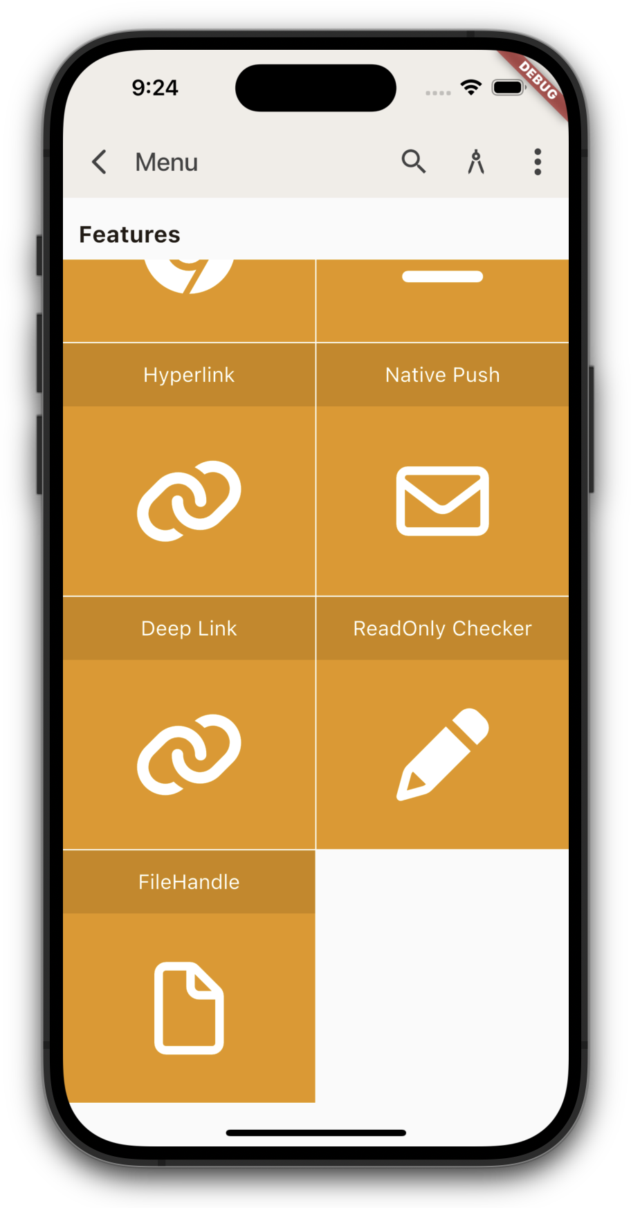
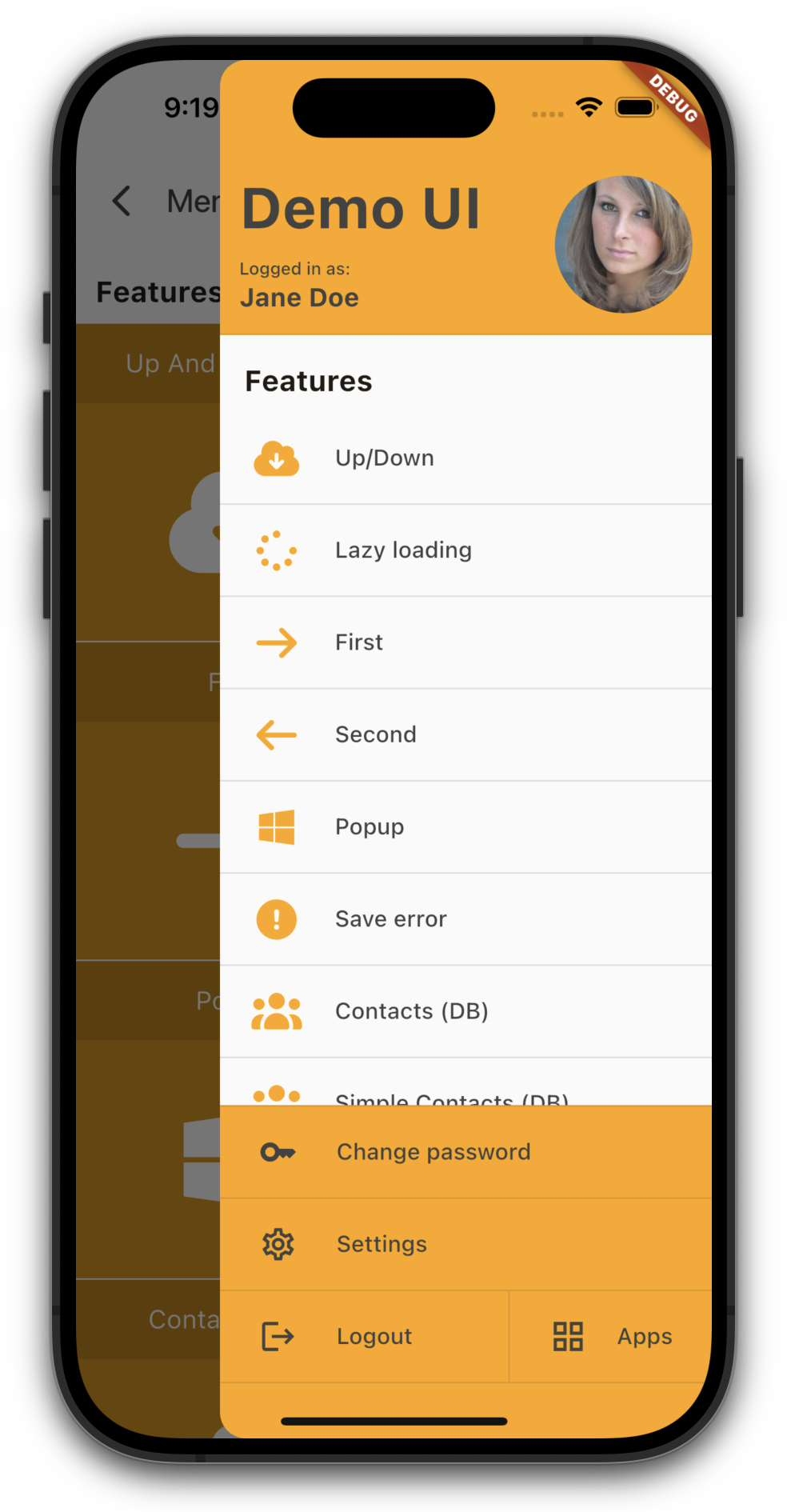
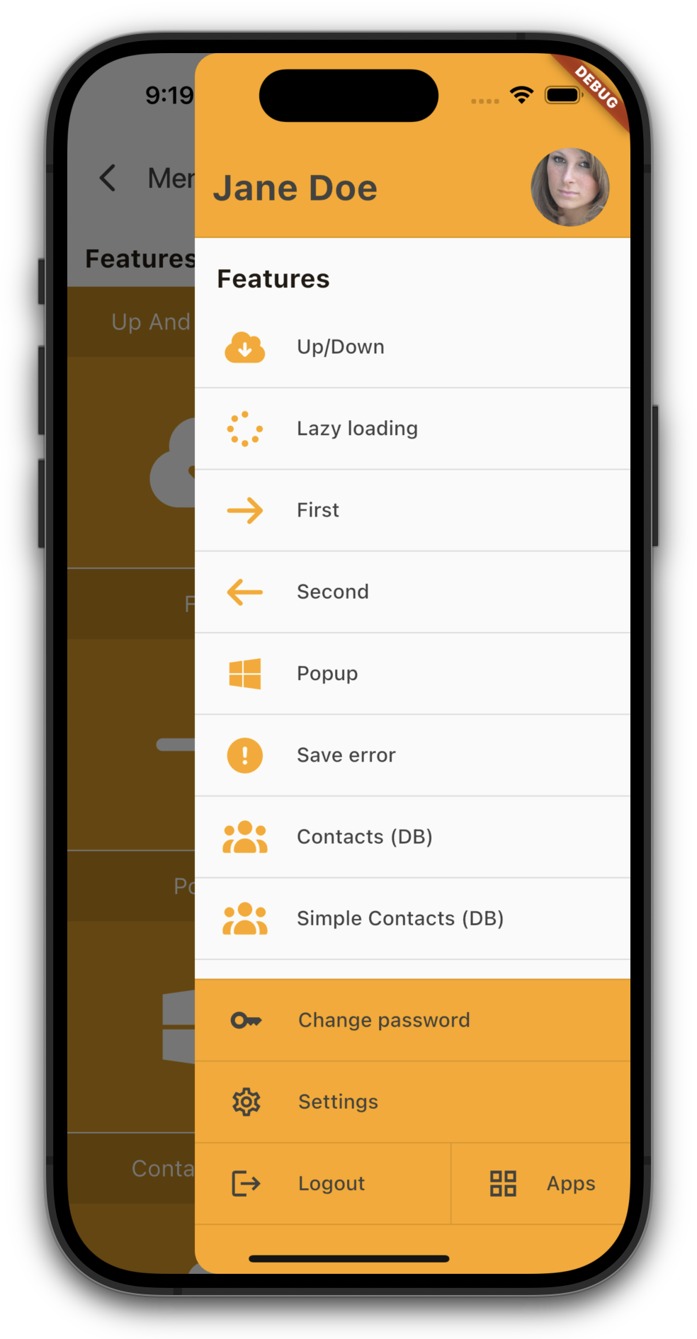
In previous versions, you couldn't scroll the last line of the menu up, which caused menu items to get cut off or overlapped on some devices. Now, you can pull the menu up a bit higher to prevent that from happening.
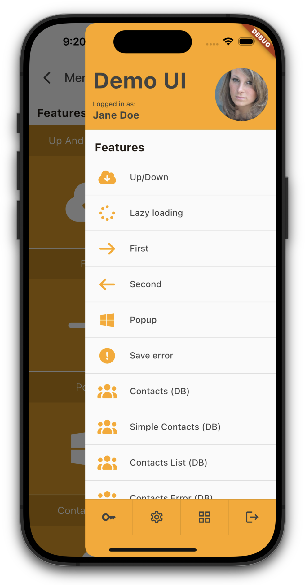
With our new compact mode for the header and/or footer, you can free up valuable space for your menu items - perfect for screen-heavy applications.
Whether you prefer a generous, information-rich layout or a sleek, space-saving design, the choice is now yours.
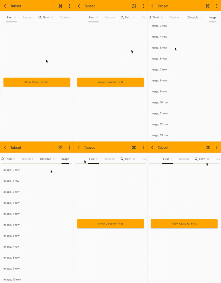
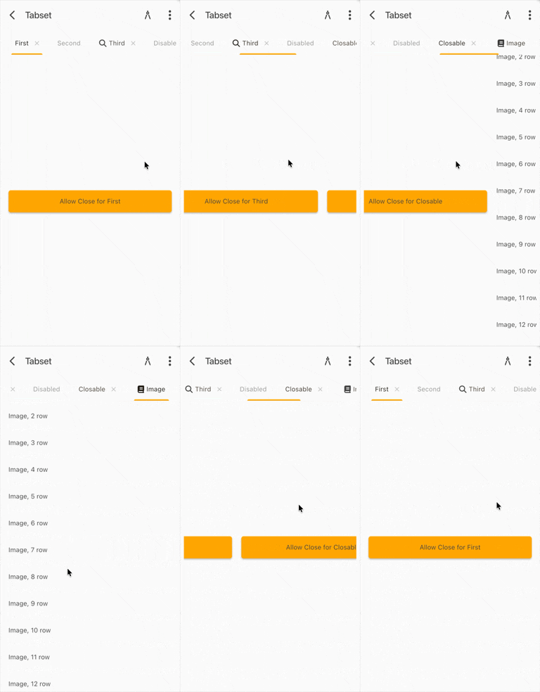
To kick off the week, we're rolling out a brand-new tabset for you. Our previous implementation was a bit too static and didn't handle swipe gestures as smoothly as we wanted. It also lacked the fluidity you'd expect on modern mobile devices.
A tabset should feel effortless - fast, responsive, and intuitive. That's why we’ve taken this component back to the workshop and given it a serious upgrade.
Here’s a quick look at how the new version stacks up against the old one:
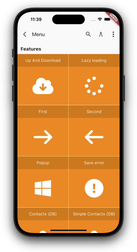
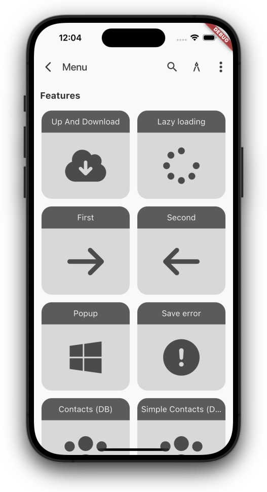
The next highlight in our styling offensive: the Main Menu.
With just a few tweaks to spacing, corner radius, and colors, you can give your app an entirely new look. A couple of entries in mobile_style.mxl — and your app transforms instantly.
You can now customize your apps better than before.
You already have the ability to design the screens exactly the way you want. You decide the layout and the positioning of the elements according to your preferences. With a few style settings, the app can then be visually enhanced.
Until now, the entire application frame, such as the menu and the appearance of input fields, buttons, tables, etc., could only be customized in the native code. But that is not something you can do in just a few seconds.
That is why we started making parts of the app/theme customizable. For example, you now have the option to define the corner radius, control button colors centrally, and much more.
Here is a small example:
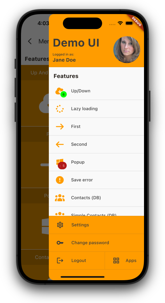
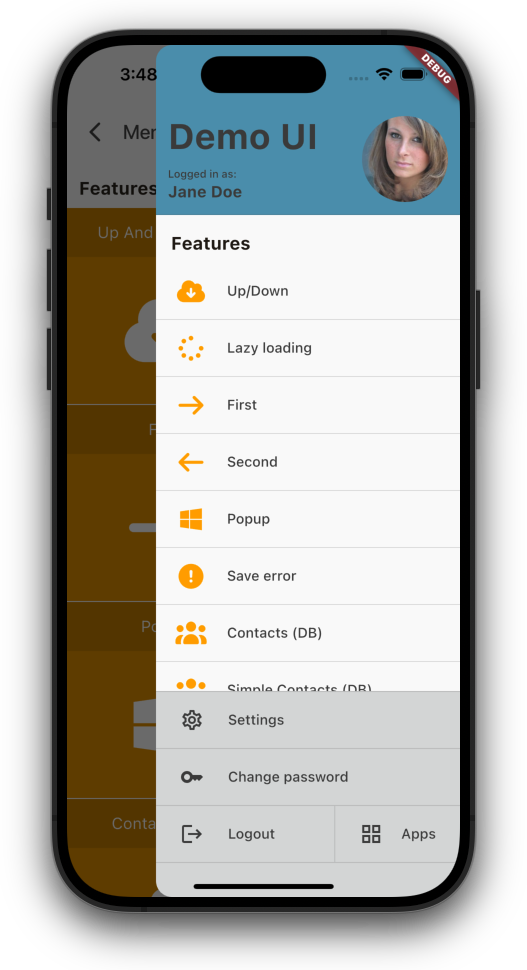
Menu (old)
Menu (new)
Just set custom colors for menu header and footer.
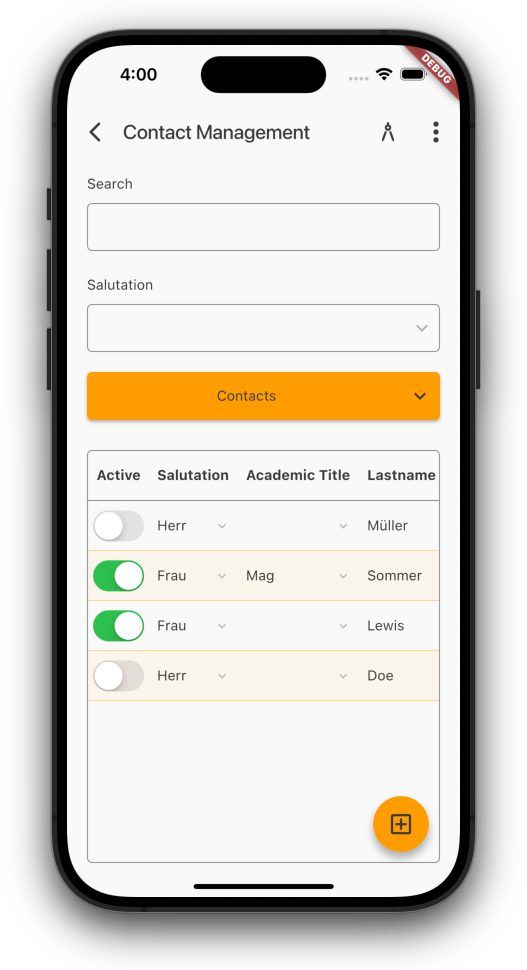
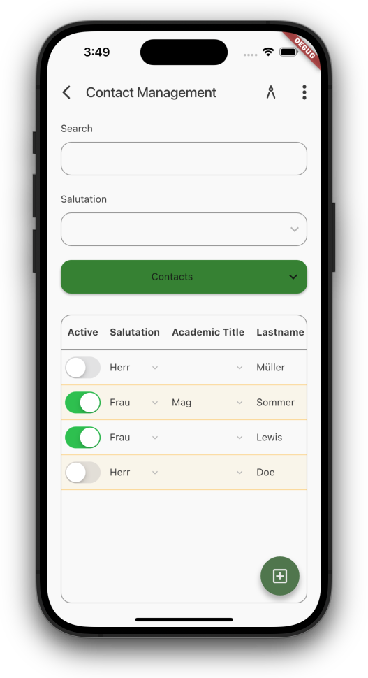
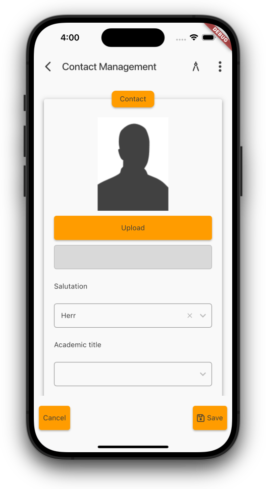
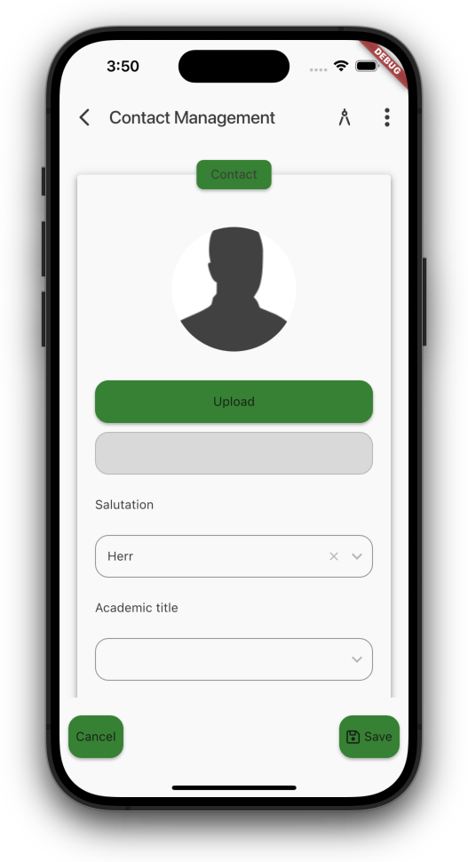
Next example, an example screen:
Default color
Custom colors
Use custom colors for buttons, custom border radius for buttons, input fields, tables.
Show images as avatar:
Image (portrait)
Image (avatar)
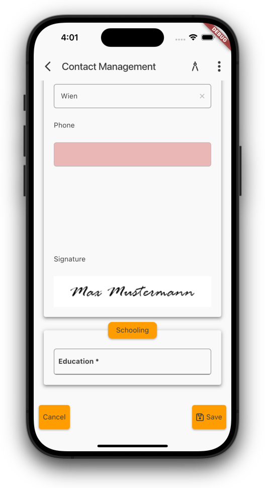
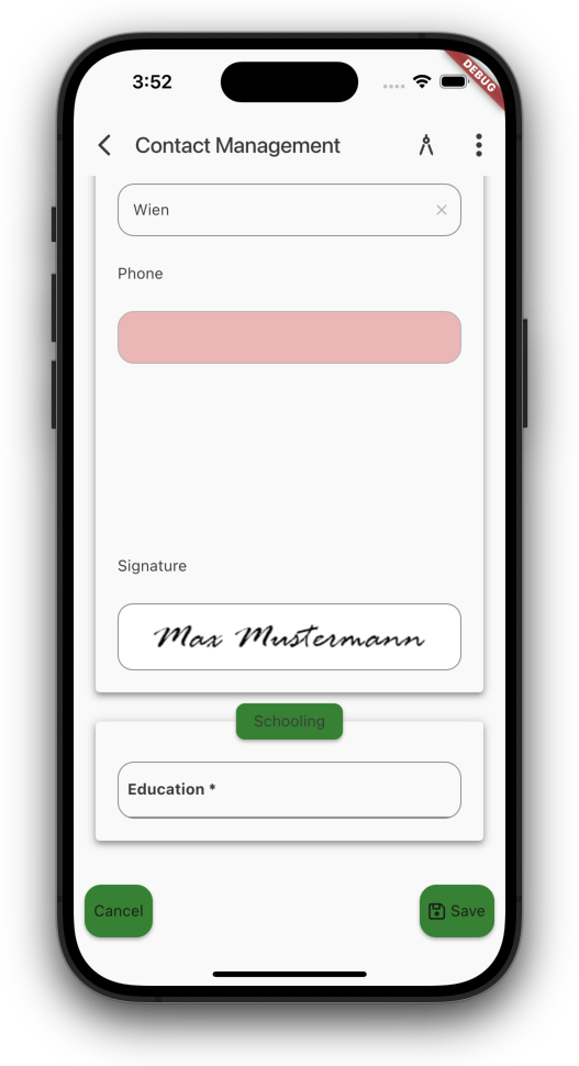
If you want, show border around images like this one:
Signature (no border)
Signature (border)
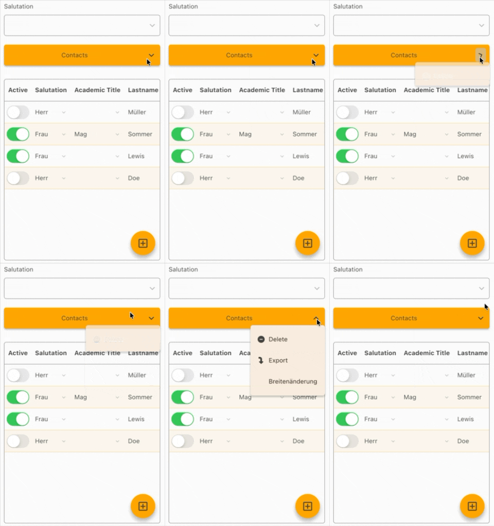
And as a little extra, menu button arrow now animates:
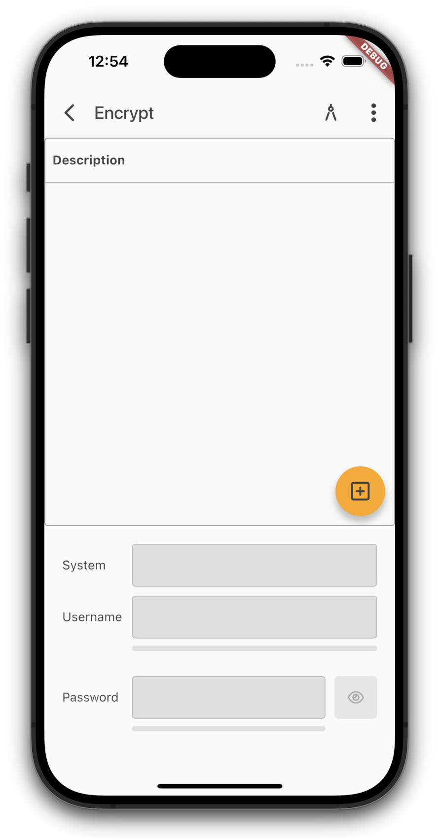
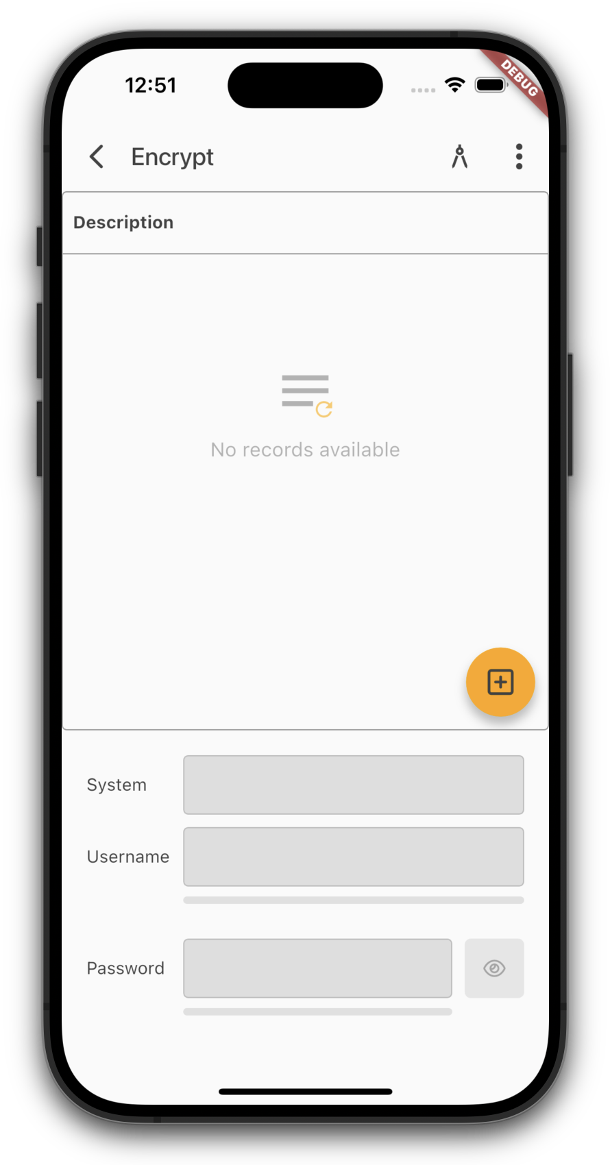
Up until now, the table would just show a big empty space whenever there were no records. Not super helpful.
To keep things clearer, we now show a friendly hint when there's nothing to display:
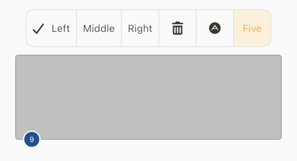
We've added a cool new component for you. It's a list of buttons that together look like a button bar.
Flutter already provides this component out of the box, but without customizing the app you can't use it. To make sure you can use it even without customization, we implemented the ButtonGroup class on the server side.
If you now include the class in a screen like this:
Our Flutter UI is now fully compatible with the latest Flutter version (3.41). We've put in the work to ensure you have full access to all the newest features Flutter has to offer.
During this process, we noticed that json_dynamic_widget is no longer being actively maintained. (We completely understand the developers' reasons, but as you know us: "Impossible" isn't in our vocabulary.)
That's why we've pivoted our implementation to the officially Google-supported solution: Remote Flutter Widgets (rfw). This brings us much closer to the Flutter core, as widgets can now be used directly in the definition file. This makes everything significantly more readable. Furthermore, there's a massive performance boost to be gained by saving templates in binary format - which we already support! In a direct comparison, rfw wins by a landslide; even with large datasets, everything remains buttery smooth. The unexpected switch has already paid off!
Why didn't we use rfw from the start? Simply because not everything was production-ready when we first tested it, and json_dynamic_widget was performing exceptionally well at the time.
This new version isn't just a compatibility upgrade; it's packed with new features:
Copy-to-clipboard button in editors (optional)
Biometric/PIN security (per app, per screen, or per button press)
Title bar styling (e.g., matching screen colors)
Customizable icons
Client-side data encryption
Empty state info text for menus
Geo-location access with alerts if location services are disabled
Caching for small images
Binary data types are now natively recognized
Password input with quality indicators (optional)
Toggle visibility for password inputs (optional)
Multi-factor authentication fixes and a fresh new look
Background images for masks or menus via API
Safe Area color customizable via API
Request reduction for better efficiency
Full support for all FontAwesome and Material Icons (by name)
We'll be diving deeper into these features over the coming weeks, but for now: it's just awesome!

 Development, News | rjahn | 31/08/2026 |
  Comments (0)


 RSS-Feed