This website uses cookies for visitor traffic analysis. By using the website, you agree with storing the cookies on your computer.More information

JVx Kitchensink, a simple JVx showcase application

As we've just noticed, we've neglected so far to properly introduce the JVx Kitchensink, a (very) simple showcase application for JVx and its controls. We'd like to rectify that now.

A simple showcase, not a demo application

The JVx Kitchensink can be found on GitHub and is available under an Apache 2.0 License. It demonstrates nearly all controls and components of the JVx framework and simple and easy to digest examples.

JVx Kitchensink

As some of you might know, there is also the JVx Hello World Application. The Kitchensink does not intend to supersede the Hello World Application, quite the opposite, the intention is to complement it. The Hello World Application is demonstrating how to quickly and easily set up a complete JVx application and have it up and running in mere minutes, with focus on the lifecycle of the application. The Kitchensink on the other hand demonstrates each individual component and control of JVx, and completely neglects the "normal" lifecycle of a JVx application.

Samples

The button bar on the left allows you to quickly access each example, for example the one about databinding.

JVx Kitchensink - Databinding

Newly added has been the feature that you can now see the source code of the selected sample right inside the Kitchensink, simply select the "Source" tab.

JVx Kitchensink - Databinding (Source)

Here I have to mention the awesome RSyntaxTextArea, which is a Swing component and provides highlighting and editing functionalities for source code, and is obviously used by us.

Regarding the lifecycle

As said before, the Kitchensink as not a good example of the lifecycle of a JVx application, as outlined in JVx Reference, Application Basics.

Packaged and ready

The Kitchensink does already come as a ready to use Eclipse project with launchers, so all you have to do is import it into Eclipse and be ready to go. There is also an Ant build script and instructions on how to launch the readily compiled jars.

Last but not least, it does provide a nice test bed for most of the functionality of JVx and demonstrates most concepts in a neatly packaged manner. We've been using it excessively during the development of the JVx JavaFX frontend bindings and it can be as simply used to test new concepts and custom components.

Once again, the link to the KitchenSink GitHub repository

JVx Vaadin UI and Vaadin 8.1

Our JVx Vaadin UI is based on vaadin 7.7.9 right now. It works great but vaadin moves forward in big steps. The latest 8.1 release contains many new features and bugfixes. Not all fixes were backported to vaadin 7. This is bad but clear for us.

So we should switch to vaadin 8.1?

This isn't an easy task because vaadin 8 has some new APIs and vaadin moved some parts like FontAwesome to new AddOns. The ContextMenu AddOn was compatible up to vaadin 7, but 8 needs the new official ContextMenu AddOn. The data bindings will work with 8 but needs a compatibility layer.

But anyway, we decided to start the migration and will do everything step-by-step. The first task will do the update of all our vaadin projects to Java 8 and vaadin 8.1. The next step will do the integration of v7 compatibility layer and the following tasks will fix all other problems like ContextMenu, FontAwesome, changed APIs. It's a bigger project and we hopefully will be finished by the end of October.

This blog post is a notice for our vaadin UI users!

We'll keep you up to date :)

Full-Screen Mode for JVx applications

If you have a JVx application and want to use it without the frame border, it's not supported out-of-the-box. Sometimes it's very useful to have a full-screen application or to grab a screenshot without frame.

We now support this feature for Swing based applications but not in the official UI API. Here's a code snippet:

//F12 for toggling mode
KeyboardFocusManager.getCurrentKeyboardFocusManager().addKeyEventDispatcher(new KeyEventDispatcher()
{
      @Override
      public boolean dispatchKeyEvent(KeyEvent e)
      {
          if (e.getKeyCode() == KeyEvent.VK_F12)
          {
              if (ObjectCache.get("FULLSCREEN") == null)
              {
                  ObjectCache.put("FULLSCREEN", Boolean.TRUE, 500);
                 
                  SwingApplication app = (SwingApplication)getLauncher();
                  app.setFullScreen(!app.isFullScreen());
                 
                  return true;
              }
             
              return false;
          }
         
          return false;
      }
});

The trick with FULLSCREEN is necessary because the event fires sometimes more than once.

Simply press F12 key to toggle between Fullscreen/Frame mode.

Vaadin AddOn for VisionX

We have a new AddOn for all VisionX users. It's the Vaadin AddOn.

The new AddOn makes it possible to integrate Vaadin AddOns from the official Vaadin AddOn Directory. It makes the integration super simple because we solved the technical problems. The AddOn does all the hard work for you and after two button clicks, everything is done.

With our new AddOn, we introduced more new VisionX features. In the next update release, it will be possible to create AddOns which have access to VisionX itself. Use the internal DataBooks or the Designer, the WizardManager and all other APIs. It'll be possible to create your own VisionX based on VisionX!

Also new is the automatic restart feature. It's possible to restart VisionX after installing an AddOn or Module with a simple button click. This feature is the base for automatic VisionX updates. Currently, we don't update VisionX automatically, but we think it will be nice for one of the next versions.

Get an impression

Vaadin AddOn for VisionX

The AddOn is commercial and not included in VisionX. Contact our sales team to get more information!

DOAG 2017

Auch in diesem Jahr sind wir wieder auf der DOAG anzutreffen. Details zur Veranstaltung.

Neu ist, das wir mit 3 Vorträgen vertreten sind:

  • Transformation: Fachbereich & IT digitalisieren gemeinsam
  • Low Code Plattform – A Web & Mobile UI Live Coding Session
  • Pimp your Forms - Forms Modernisierung mit Java

Nähere Details zu den Vorträgen, sind demnächst im Vortragsprogramm zu finden.

GUI Testing with VisionX

A new AddOn for VisionX is coming :)

Our GUI testing tool

A first impression

Application tester

Application tester

The tool is a recorder for VisionX/JVx applications. It has an option to export created tests as JUnit tests which makes it easy for Software developers to integrate the GUI tests in their CI systems. It's a super easy tool with so much value for you!

The App Tester will be available in our solution store and will be an AddOn for VisionX.

If you are interested in details, leave a comment.

JVx Reference, Resource and UIResource

Let's talk about Resources and UIResources, and why they sound similar but are not the same.

The Basics

We've previously covered how the JVx GUI layer works, now we are going to have a better look at the Resources and UIResources. With "Resource" we do not mean images or similar, we mean the implementation at the technology layer which is encapsulated by a wrapper class (Bridge Pattern). An "UIResource" on the other hand is an encapsulated concrete implementation of one of the interfaces on the UI layer.

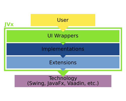
Let's do a short brush-up on how the JVx architecture looks like in regards to the GUI stack:

JVx Resource

The UI Wrappers are the main UI classes which are used to create the GUI (f.e. UIButton). These are wrapping the Implementations (f.e. a SwingButton) which themselves are wrapping the Extension/Technology (f.e. a JVxButton/JButton). Only the UI and Implementation classes are implementing the interface required for the component (f.e. IButton). That also means that the Implementation is dependent on the Extension/Technology component, but the UI can use any object which implements the interface.

Now, with that knowledge we can start defining what is what:

JVx Resource 2

The resource itself, accessed by calling <uiwrapper>.getResource(), is the Extension/Technology component. The uiresource can be accessed by calling <uiwrapper>.getUIResource(). The uicomponent can be accessed by calling <uiwrapper>.getUIComponent() and is usually the UI Wrapper itself. If we use our previous Swing example, the resource would be a JVxButton/JButton, the uiresource would be the SwingPanel and the uicomponent would be the UIButton.

As one can see, access to all objects which are comprising the GUI is at all times possible. We, of course, have the UI component, we can access the Implementation component and we can access the Extension/Technology component. Theoretically we could also swap them at runtime, but in JVx this is limited to the construction of the object to greatly reduce the error potential.

Creating custom components

Equipped with that knowledge, we can revisit the previous guide on how to create custom components, the part about the BeepComponent to be exact:

  1. public class BeepComponent extends UIComponent<IPanel>
  2. {
  3.    public BeepComponent()
  4.    {
  5.       super(new UIPanel());
  6.        
  7.       UIButton highBeepButton = new UIButton("High Beep");
  8.       highBeepButton.eventAction().addListener(Beeper::playHighBeep);
  9.      
  10.       UIButton lowBeepButton = new UIButton("Low Beep");
  11.       highBeepButton.eventAction().addListener(Beeper::playLowBeep);
  12.      
  13.       UIFormLayout layout = new UIFormLayout();        
  14.      
  15.       uiResource.setLayout(layout);
  16.       uiResource.add(new UILabel("Beep"), layout.getConstraints(0, 0, -1, 0));
  17.       uiResource.add(highBeepButton, layout.getConstraints(0, 1));
  18.       uiResource.add(lowBeepButton, layout.getConstraints(1, 1));
  19.    }
  20. }

We are setting a new UIResource (an UIPanel) in the constructor (at line #5) which is to be used by the UIComponent. In this case it is not an Implementation, but another UI component, but that doesn't matter because the UIResource only must implement the expected interface. At line #15 we start using that custom UIResource.

Because UIComponent is an abstract component designed for exactly this usage, the example might not be the most exciting one, but it clearly illustrates the mechanic.

Bolting on functionality

Also from the previous guide on how to create custom components we can reuse the PostfixedLabel as example.

  1. private UILabel testLabel = new UILabel()
  2. {
  3.     public UILabel()
  4.     {
  5.         super(new PostfixedLabel("", "-trial"));
  6.     }
  7. };

Now testLabel will be using the PostfixedLabel internally, but with no indication to the user of the object that this is the case. This allows to extend the functionality of a component completely transparently, especially in combination with functions which do return an UIComponent and similar.

An important note about the component hierarchy

If we create a simple component extensions, like the BeepComponent above, it is important to note that there is one other layer of indirection in regards to the hierarchy on the technology layer. If we create a simple frame with the BeepComponent in it, one might expect the following hierarchy:

         UI                   Technology
---------------------    ----------------------
 UIFrame                  Frame
   \-UIPanel                \-Panel
       \-BeepComponent          \-BeepComponent
                                    \-Panel
                                        |-Label
                                        |-Button
                                        \-Button

With the BeepComponent added and its sub-components as its children. However, the actual hierarchy looks like this:

         UI                   Technology
---------------------    ----------------------
 UIFrame                  Frame
   \-UIPanel                \-Panel
       \-BeepComponent          \-Panel
                                    |-Label
                                    |-Button
                                    \-Button

That is because such extended components are not "passed" to the Technology, they do only exist on the UI layer because they do not have a Technology component which could be used. That is done by adding the UIComponent to the UI parent, but for adding the actual Technology component the set UIResource is used.

The special case of containers

Another special case are containers. For example we could create a panel which does display an overlay in certain situations and we will need to use that throughout the whole application.

UIResourceContainer Example

That means we do not want to build it every time anew, so one option would be to use a factory method to "wrap" the content, something like this:

  1. UIFormLayout panelLayout = new UIFormLayout();
  2. panelLayout.setHorizontalAlignment(UIFormLayout.ALIGN_CENTER);
  3. panelLayout.setVerticalAlignment(UIFormLayout.ALIGN_CENTER);
  4.    
  5. UIPanel panel = new UIPanel();
  6. panel.setLayout(panelLayout);
  7. panel.add(new UILabel("Firstname"), panelLayout.getConstraints(0, 0));
  8. panel.add(new UITextField("John"), panelLayout.getConstraints(1, 0));
  9. panel.add(new UILabel("Lastname"), panelLayout.getConstraints(2, 0));
  10. panel.add(new UITextField("Doe"), panelLayout.getConstraints(3, 0));
  11. panel.add(new UILabel("Street"), panelLayout.getConstraints(0, 1));
  12. panel.add(new UITextField("Old R. Road"), panelLayout.getConstraints(1, 1, 3, 1));
  13. panel.add(new UILabel("ZIP"), panelLayout.getConstraints(0, 2));
  14. panel.add(new UITextField("11946"), panelLayout.getConstraints(1, 2));
  15. panel.add(new UILabel("Place"), panelLayout.getConstraints(2, 2));
  16. panel.add(new UITextField("Hampton Bays"), panelLayout.getConstraints(3, 2));
  17.    
  18. parentContainer.add(OverlayPanelFactory.wrap(panel), UIBorderLayout.CENTER);

And the wrap method itself:

  1. public static final UIPanel wrap(IComponent pContent)
  2. {
  3.     UILabel overlayLabel = new UILabel("FOR YOUR<br>EYES ONLY");
  4.     overlayLabel.setBackground(null);
  5.     overlayLabel.setFont(UIFont.getDefaultFont().deriveFont(UIFont.BOLD, 48));
  6.     overlayLabel.setForeground(UIColor.createColor("#3465a4"));
  7.     overlayLabel.setHorizontalAlignment(UILabel.ALIGN_CENTER);
  8.    
  9.     UIFormLayout layout = new UIFormLayout();
  10.    
  11.     UIPanel panel = new UIPanel();
  12.    
  13.     panel.setLayout(layout);
  14.     panel.setBackground(UIColor.createColor("#3465a4"));
  15.     panel.add(overlayLabel, layout.getConstraints(0, 0, -1, -1));
  16.     panel.add(pContent, layout.getConstraints(0, 0, -1, -1));
  17.    
  18.     return panel;
  19. }

Which is easy enough, but let's say we'd like to add logic to that wrapper, at that point it becomes more complicated. We can't use the same technique as for custom component from above, because in that case the "overlaying panel" would simply not be displayed. However, there is a similar mechanism for containers, setting the UIResourceContainer.

The UIResourceContainer is another special mechanism which works similar to setting the UIResource, but it works exactly the other way round. While setting the UIResource does "hide" components from the Technology which are there in UI layer, setting the UIResourceContainer does hide components from the UI layer while there are added in the Technology. A little bit complicated, here is our example again using this technique:

  1. public static class OverlayedPanel extends UIPanel
  2. {
  3.     public OverlayedPanel()
  4.     {
  5.         super();
  6.        
  7.         UILabel overlayLabel = new UILabel("FOR YOUR<br>EYES ONLY");
  8.         overlayLabel.setBackground(null);
  9.         overlayLabel.setFont(UIFont.getDefaultFont().deriveFont(UIFont.BOLD, 48));
  10.         overlayLabel.setForeground(UIColor.createColor("#3465a4"));
  11.         overlayLabel.setHorizontalAlignment(UILabel.ALIGN_CENTER);
  12.        
  13.         UIPanel innerPanel = new UIPanel();
  14.        
  15.         UIFormLayout layout = new UIFormLayout();
  16.        
  17.         setLayout(layout);
  18.         setBackground(UIColor.createColor("#3465a4"));
  19.         add(overlayLabel, layout.getConstraints(0, 0, -1, -1));
  20.         add(innerPanel, layout.getConstraints(0, 0, -1, -1));
  21.        
  22.         setUIResourceContainer(innerPanel);
  23.     }
  24. }

What we've done is extend an UIPanel (line #1), setting it up and adding children and then we've declared one of its children as the UIResourceContainer (line #22). So all methods which are specific to IContainer (adding children, setting a layout, etc.) are now forwarding to the innerPanel and manipulating the contents of the OverlayedPanel directly is not directly available.

And here is how it is used:

  1. UIFormLayout panelLayout = new UIFormLayout();
  2. panelLayout.setHorizontalAlignment(UIFormLayout.ALIGN_CENTER);
  3. panelLayout.setVerticalAlignment(UIFormLayout.ALIGN_CENTER);
  4.    
  5. UIPanel panel = new OverlayedPanel();
  6. panel.setLayout(panelLayout);
  7. panel.add(new UILabel("Firstname"), panelLayout.getConstraints(0, 0));
  8. panel.add(new UITextField("John"), panelLayout.getConstraints(1, 0));
  9. panel.add(new UILabel("Lastname"), panelLayout.getConstraints(2, 0));
  10. panel.add(new UITextField("Doe"), panelLayout.getConstraints(3, 0));
  11. panel.add(new UILabel("Street"), panelLayout.getConstraints(0, 1));
  12. panel.add(new UITextField("Old R. Road"), panelLayout.getConstraints(1, 1, 3, 1));
  13. panel.add(new UILabel("ZIP"), panelLayout.getConstraints(0, 2));
  14. panel.add(new UITextField("11946"), panelLayout.getConstraints(1, 2));
  15. panel.add(new UILabel("Place"), panelLayout.getConstraints(2, 2));
  16. panel.add(new UITextField("Hampton Bays"), panelLayout.getConstraints(3, 2));
  17.    
  18. parentContainer.add(panel, UIBorderLayout.CENTER);

Notice that we can use it is any other panel (line #5) and simply add it to the parent (line #18). For a user of the API it is transparent as to whether there are more components or not, this is also visible in the created component hierarchy:

         UI                   Technology
---------------------    ----------------------
 UIPanel                  Panel
   \-OverlayedPanel         \-Panel
       |-UILabel                |-Label
       |-UITextField                \-Panel
       |-UILabel                    |-Label
       |-UITextField                |-TextField
       |-UILabel                    |-Label
       |-UITextField                |-TextField
       |-UILabel                    |-Label
       |-UITextField                |-TextField
       |-UILabel                    |-Label
       \-UITextField                |-TextField
                                    |-Label
                                    \-TextField

This makes it very easy to have containers which add additional components without the actual GUI noticing or caring.

Conclusion

Because of the way the JVx framework is designed, it is easy to access all layers of the GUI framework and also facilitate the usage of these layers to create custom components and allow easy access to the wrapped components, no matter on what layer or of what kind they are.

VisionX Demo Application

With the preparations for the VisionX 2.4 Update 1 we've also created several simple but telling demo applications. Let's have a look at these.

Demo-AMLD

We start our short tour with the first demo, the "Aircraft Manufacturing Line Dashboard" which is emulating a dashboard as it can be found in various factories and manufacturing companies.

DemoAMLDDemoAMLD

Its main frontend is a Swing based GUI which displays (randomly generated) data, additionally there is a Vaadin powered frontend which displays the raw data. The main highlights of this demo are:

  • Capability to customize technology-specific components.
  • Utilizing custom components in the VisionX designer.
  • Usage of cell formatters.
  • Making WorkScreens only available in certain environments.
  • Data is generated with either the Random object or OpenSimplexNoise.

Demo-BIELS

This is a demo of a typical dashboard and master data forms of an ERP application, in this case a small company focused on import and export of chemical/biochemical materials and similar.

DemoBIELSDemoBIELS

All WorkScreens are fully functional in Swing and Vaadin environments. The main highlights of this demo are:

  • Demonstration of feature parity and interchangeability between Swing and Vaadin.
  • Creation of custom controls for displaying data.
  • Fully and easily editable with the VisionX designer.

Demo-CNASP

Next up is a demonstration of the ability to create end-user facing web portals with JVx and VisionX.

DemoCNASPDemoCNASP

The whole application is designed to function on large and small displays alike, like those of smartphones. The main highlights are:

  • Demonstration of extensive customization via CSS.
  • Differing layouts depending on the environment (Desktop, Tablet, Smartphone).

Demo-DMARS

Accessing data and documents on the go is always kind of a hassle, but we can make it easier and more comfortable by providing easy to use GUIs for such occasions.

DemoDMARSDemoDMARS

This simple document management system shows off a simple and easy to use GUI for accessing and manipulating documents in the storage. The highlights are:

  • GUI designed to be used on small, touch-enabled displays.
  • Extending the Table to allow checkbox based multi-row selection.
  • Inserting and retrieving files from a database.
  • The new Upload component available in ProjX.

Demo-Reports

Last but, not least, is the "big guide" of how to use reporting in VisionX.

DemoReportsDemoReports

This application will take you step by step through the capabilities and features of the VisionX reporting solution. Every WorkScreen demonstrates another feature complete with a description, example, access to the template and final report and of course the related documentation.

  • A step-by-step introduction to the VisionX reporting solution.
  • 12 examples with easy to read and documented source code.
  • All parts easily accessible: Source code, Template, Data and Report.

Availability

All these applications are available in the VisionsX Solution Store, on demand. The source code is licensed under the permissive Apache License.

VisionX 2.4 update I is out

VisionX 2.4 update release I is out. The exact version number is 2.4.544.310.
It's a powerful update release becasue it contains latest versions of relevant opensource libraries and frameworks.

What's new?

  • Thumbnails

    If application contains a thumbnail, VisionX won't add a random thumbnail anymore.

  • HTML5 Theme

    It's now possible to change the HTML5 theme via web settings: Standard, Valo, Mobile

    Web settings

    Web settings

  • Live preview

    Live preview does now work if you apply external changes or if you change the source code in Eclipse (with installed EPlug).

  • GridLayout is now supported

    The GridLayout of JVx is now officially supported in VisionX' Designer.

  • Vaadin 7.7.9

    VisionX updates contains Vaadin 7.7.9.

  • Solution store update

    The solution store now shows available solutions based on your VisionX version.

  • New demo solutions

    We have awesome new demo applications for licensed users.

    Demo applications

    Demo applications

  • New Reporting demo

    The reporting demo is a complete documentation about VisionX reporting features and the reporting API.

    Reporting

    Reporting

    Report overview

    Report overview

  • Smaller bugfixes

All customers will find the new version in their download area!
The trial version was updated as well!

JVx Reference, DataBooks

Let's talk about DataBooks, which allow access to data without any effort.

What is it?

DataBooks are an active model, which allow you to directly query and manipulate the data. Contrary to many other systems JVx does not map the data into objects, but instead allows you to directly access it in a table like fashion, exposing columns, rows and values.

One could say that it is like a three dimensional array, with these dimensions:

  1. DataPages
  2. DataRows
  3. Columns/Values

With DataPages containing DataRows, which itself contain the values and everything is referencing the RowDefinition, which outlines how a row looks like.

DataBook Architecture

RowDefinition

The RowDefinition defines what columns are available in the row and stores some additional information about them, like the names of the primary key columns. You can think of the RowDefinition as the headers of a table.

Its creation and usage is rather simple, and if you're working with RemoteDataBooks there is no need to create one at all, as it is automatically created when the DataBook is opened. A RowDefinition holds and manages ColumnDefinitions, which define the columns.

RowDefinition rowDefinition = new RowDefinition();
rowDefinition.addColumnDefinition(columnDefinitionA);
rowDefinition.addColumnDefinition(columnDefinitionB);
rowDefinition.addColumnDefinition(columnDefinitionC);

dataBook.setRowDefinition(rowDefinition);

ColumnDefinition

The ColumnDefinition defines and provides all necessary information about the column, like its DataType, its size and if it is nullable or not. You can think of it as one column in a table.

ColumnDefinition columnDefinition = new ColumnDefinition("NAME", new StringDataType());
columnDefinition.setNullable(false);

MetaData

Most of the ColumnDefinition is additional information about the column, like if it is nullable, the label of the column, default values, allowed values and similar information.

DataType

Of course we must define what type the value in the column has, this is done by setting a DataType on the ColumnDefinition. The DataType defines what kind of values the column holds, like if it is a String, or a Number or something else. We do provide the widest used DataTypes out of the box:

  • BigDecimal
  • BinaryData
  • Boolean
  • Long
  • Object
  • String
  • Timestamp

It is possible to add new DataTypes by simply implementing IDataType.

DataRow

The DataRow repesents a single row of data, it holds/references its own RowDefinition and of course provides access to the values of the row. Accessing the DataRow can be done either by column index or column name, and the methods do either return or accept Objects. Let's look at a simple usage example:

DataRow dataRow = new MemDataRow(rowDefinition);

String value = (String)dataRow.getValue("COLUMN_A");

dataRow.setValue("COLUMN_A", "New Value");

DataPage

The DataPage is basically a list of DataRows, it also holds its own RowDefinition which is shared with all the contained DataRows.

The main usage of DataPages is to allow paging in a master/detail relationship. If the master selects a different row, the detail databook does select the related DataPage.

DataBook

The DataBook is the main model of JVx, it provides direct access to its current DataPage and DataRow by extending from IDataRow and IDataPage.

By default, the DataBook holds one DataPage and only has multiple DataPages if it is the detail in a master/detail relationship.

Usage example

Here is a simple usage example of a MemDataBook, an IDataBook implementation which does only operate in memory:

IDataBook dataBook = new MemDataBook();
dataBook.setName("test");
dataBook.getRowDefinition().addColumnDefinition(new ColumnDefinition("ID", new LongDataType()));
dataBook.getRowDefinition().addColumnDefinition(new ColumnDefinition("COLUMN_STRING", new StringDataType()));
dataBook.open();

dataBook.insert(false);
dataBook.setValue("ID", Long.valueof(0));
dataBook.setValue("COLUMN_STRING", "VALUE");

dataBook.insert(false);
dataBook.setValue("ID", Long.valueof(1));
dataBook.setValue("COLUMN_STRING", "VALUE_A");

dataBook.saveSelectedRow();

dataBook.setSelectedRow(0);

dataBook.setValue("COLUMN_STRING", "VALUE_NEW");

dataBook.saveSelectedRow();

dataBook.setSelectedRow(1);

dataBook.delete();

Accessing the data with Strings

One of the major advantages of the DataBook concept is that there is no need to create new classes to represent each table, view or query result. One can always use the DataBook, directly and easily and model changes don't necessitate changes on the client side. The downside to this approach is that we lose compile time checks because we access the data dynamically. However, This can be mitigated by using EPlug, an Eclipse plugin which provides compile time checks and many more features.

No primitives, Objects only

We do not provide overloads to fetch primitives, that is because there are mainly three types of data inside a database:

  1. Numbers
  2. Text
  3. Binary Data

Text and Binary Data are both objects (arrays of primitives are Objects after all) and Numbers are either primitives or Objects. Most of the time if we deal with numbers inside a database we want them to be of arbitrary precision, which means we must represent them as BigDecimal. Supporting double or float in these cases would be dangerously, because one might write a float into the database which might or might not end up with the correct value in the database. To completely eliminate such problems, we do only support Objects, which means that one is "limited" to the usage of Number extensions like BigLong and BigDecimal, which do not suffer from such problems.

Where are the DataPages?

What is not clear from this example is how and when DataPages are used. As a matter of fact, most of the time there is no need to think about DataPages because they are managed directly by the DataBook, and if used this like there is only one DataPage. Multiple DataPages will be used if there is a Master/Detail relationship defined in which case the DataBook does select the correct DataPage automatically.

Master/Detail

Master/Detail is something that occurs in nearly every data model. It means simply that there is one master dataset which is referenced by one or multiple detail datasets. Or to express it in SQL:

SELECT
  *
FROM
  MASTER m
  LEFT JOIN DETAIL d ON m.ID=d.MASTER_ID;

We can of course express a Master/Detail relationship when using DataBooks. For that we just create a ReferenceDefinition and assign it to the Detail DataBook:

IDataBook masterDataBook = new MemDataBook();
masterDataBook.setName("master");
masterDataBook.getRowDefinition().addColumnDefinition(new ColumnDefinition("ID", new LongDataType()));
masterDataBook.open();

IDataBook detailDataBook = new MemDataBook();
detailDataBook.setName("detail");
detailDataBook.getRowDefinition().addColumnDefinition(new ColumnDefinition("ID", new LongDataType()));
detailDataBook.getRowDefinition().addColumnDefinition(new ColumnDefinition("MASTER_ID", new LongDataType()));
detailDataBook.setReferenceDefinition(new ReferenceDefinition(new Streing[] {"MASTER_ID"}, masterDataBook, new String[] {"ID"});
detailDataBook.open();

Let's assume the following data for illustration purposes:

MASTER              DETAIL
======        =================
  ID            ID  | MASTER_ID
------        ------|----------
     1             1|         1
     2             2|         1
     3             3|         2
                   4|         2
                   5|         2
                   6|         3
                   7|         3
                   8|         3

Now if we select the second row in the masterDataBook, the detailDataBook will just contain the rows with the corresponding MASTER_ID, so 3, 4 and 5.

MASTER              DETAIL
======        =================
  ID            ID  | MASTER_ID
------        ------|----------
     1             3|         2
S    2             4|         2
     3             5|         2

The detailDataBook is automatically adjusted according to the selection in the masterDatabook. Of course this can have an arbitrary depth, too.

Conclusion

The DataBook is the backbone of JVx, it provides a clean and easy way to access and manipulate data. At the same time, it is flexible and can be customized to specific needs with ease.